Saab Cars, a Swedish automobile manufacturer, had a rich history spanning over seven decades before it ceased production in 2011. The brand had a unique identity, with its logo featuring a red griffin that has become an iconic symbol of the company. The origins of the logo, however, are not entirely clear, with several theories surrounding its creation and evolution over time.
The Birth of the Griffin
Saab’s iconic logo featuring a red griffin first appeared in 1974. The griffin is a mythical creature with the head and wings of an eagle and the body of a lion. Some theories suggest that the griffin on the Saab logo was inspired by the coats of arms of the Swedish provinces of Skåne and Östergötland. Both coats of arms feature griffins, with Skåne’s griffin being red and Östergötland’s being blue.
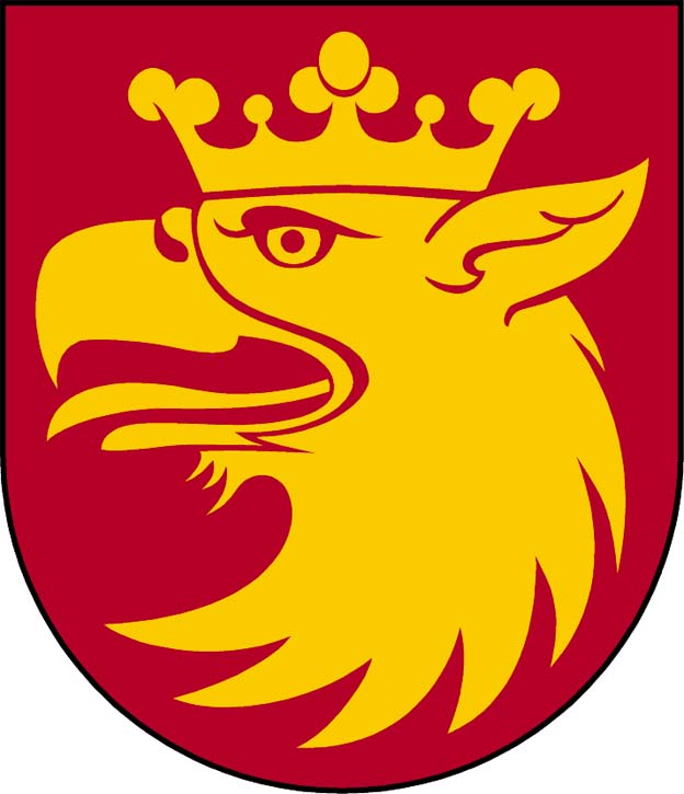
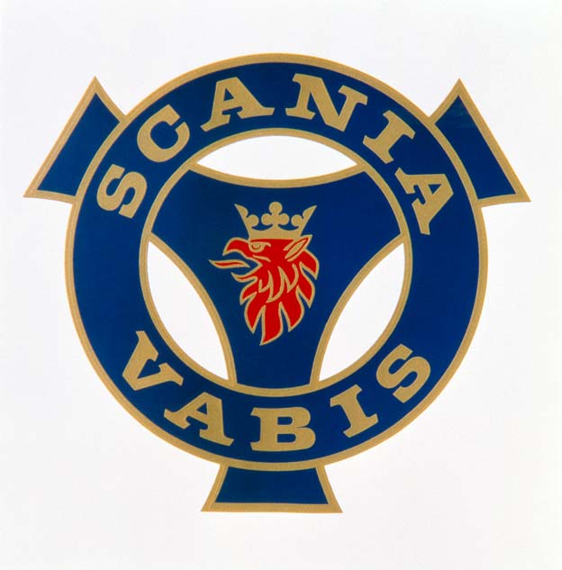
Other theories suggest that the logo was a nod to Saab’s former partner, Scania-Vabis, which was based in Skåne. Scania-Vabis was a manufacturer of trucks, buses, and military vehicles and had been involved in a partnership with Saab since the 1940s.
Some believe that the red griffin was a way for Saab to pay tribute to its former partner and the region where it was based.
The Evolution of the Logo
Over the years, Saab’s logo underwent several changes, with each iteration reflecting the company’s growth and evolution. In the 1980s, the logo featured a stylized version of the griffin with the word “Saab” written in bold letters underneath. The design was simple and clean, reflecting the minimalist design aesthetic of the time.
In 2000, General Motors acquired a majority stake in Saab and launched a new version of the logo. The new logo featured a more stylized griffin with the word “Saab” written in a lowercase font underneath. The design was intended to convey a sense of modernity and sophistication, reflecting the brand’s efforts to reposition itself as a premium automaker.
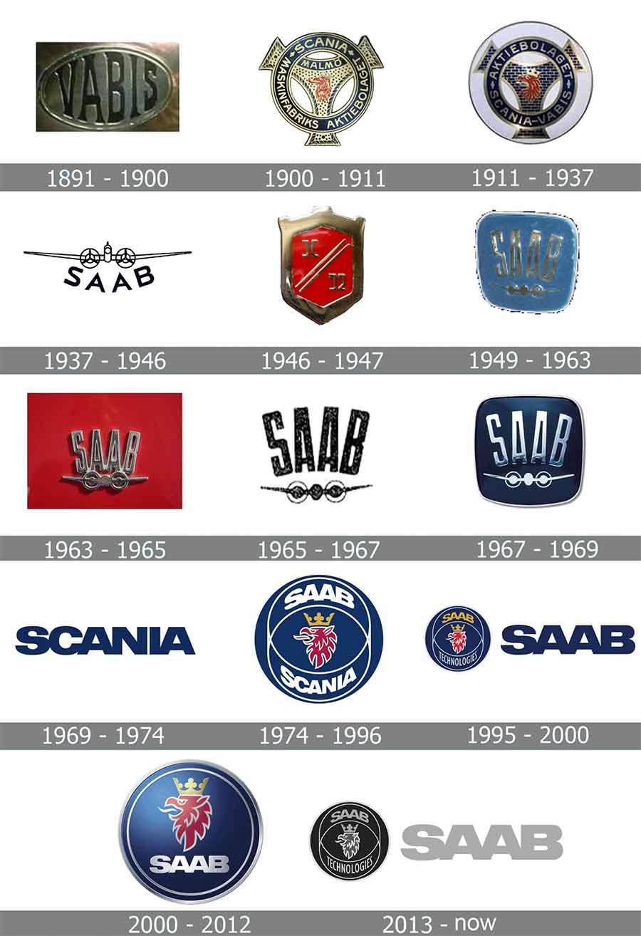
In 2013, Saab introduced a new version of the logo that was similar to the 2000 design but featured the word “Saab” written in gold. The gold lettering was intended to give the logo a more premium look and feel, emphasizing the brand’s commitment to luxury and innovation.
The Legacy of Saab’s Logo
Although Saab Cars no longer exists as a brand, its logo remains an iconic symbol of Swedish automotive history. The red griffin has become synonymous with Saab and is instantly recognizable to anyone familiar with the brand. The logo’s evolution over the years reflects the company’s growth and transformation, from its early days as a manufacturer of aircraft to its later years as a producer of high-end luxury vehicles.
Despite its rich history and iconic status, the future of Saab’s logo is uncertain. While the brand lives on in the defense industry, it is unclear whether the logo will continue to be used in any meaningful way. However, for Saab enthusiasts and fans of Swedish automotive history, the red griffin will always hold a special place in their hearts and minds.
In conclusion, Saab Cars’ logo featuring a red griffin has a rich history that reflects the brand’s growth and evolution over the years. While the origins of the logo remain unclear, its iconic status as a symbol of Swedish automotive history is undeniable. Although Saab Cars no longer exists as a brand, its legacy lives on through its iconic logo and the memories of the brand’s loyal enthusiasts.




I am pleased that someone took the time to thoroughly research the history of SAAB logos! Bravo to the researcher(s). It would be great to know the genesis of the griffin but some things just might be lost to the ages. My favorite logos, in descending order, are the 2000-2012 (I realize that it may have been a GM-directed art project), followed by the 1949-1963 edition (No, … it is not a griffin but one of the first SAAB badges that I remember seeing in my younger years — I am beyond seventy now.), and the 1967-1969 edition (A very refined version of the 1949 edition). I loved the shot of the “SAAB” nameplate that appears on the rear of the 2010 9-5 NG–it looks great here and on my own 2010 SAAB 9-5 NG!
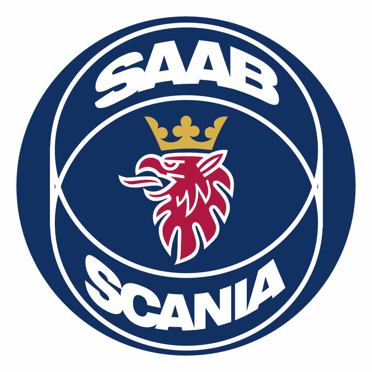
Incorrect. The Griffin symbol with SAAB SCANIA appeared in 1984, not 1974. And lasted until MY2000.
Saab and Scania parted company in 1995, Scania adopted it’s own version of the Griffin shortly thereafter and the one for the cars was simplified (only SAAB) in 2000 just after GM took over.